This was a class project that involved redesigning the website for A Child’s Delight into a responsive web design. I created responsive layouts that looked simpler and more modern, and added category images on the drop-down menu to make it easier for users to find products.
Nov. 2017 - Dec. 2017
A class project
Responsive web design, Wireframes, Mock-ups
Adobe XD, Illustrator, Photoshop
To make a website that is easy to find items of interest, provide useful information about items and services, and is efficient to purchase.
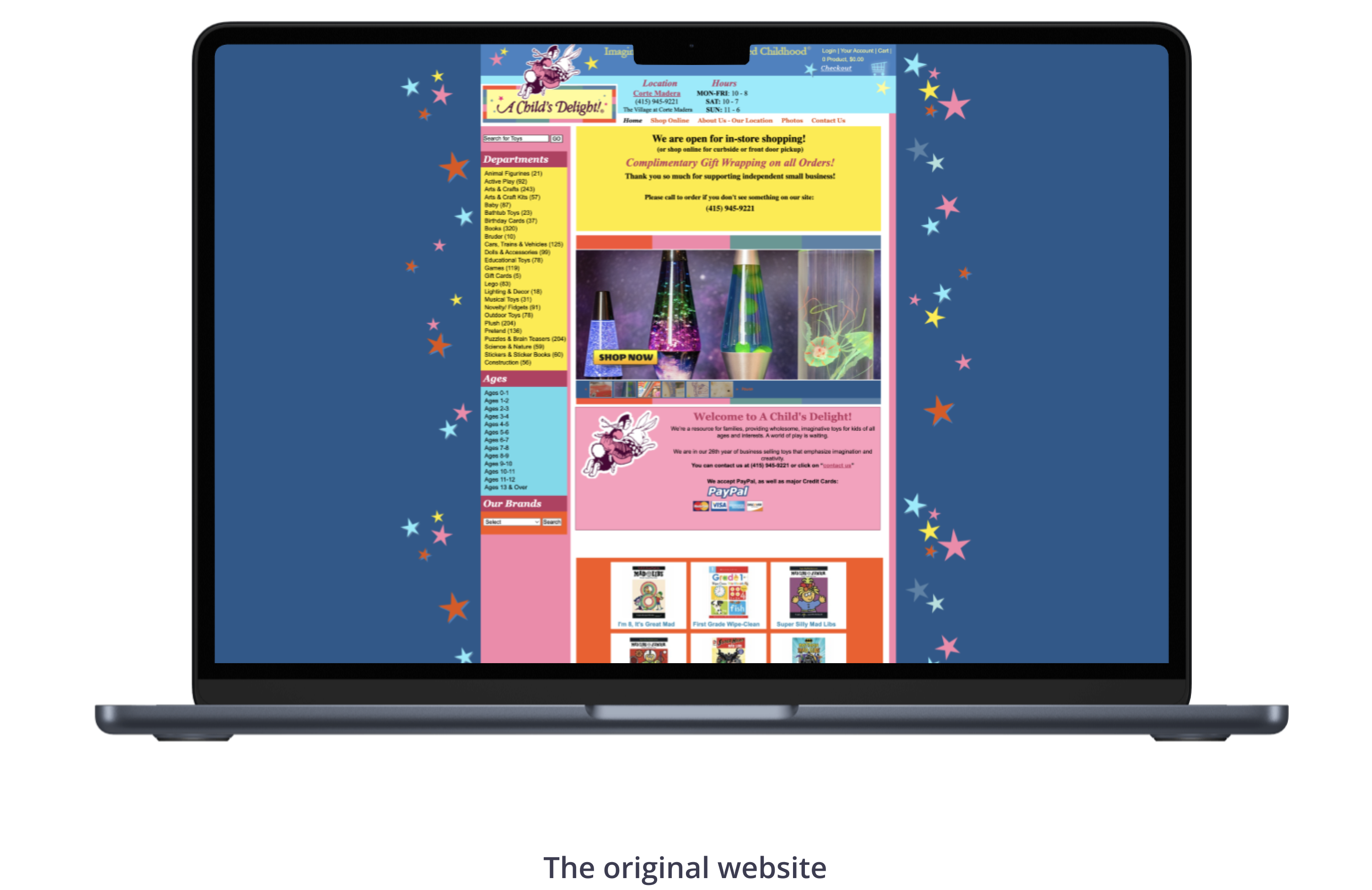
Navigation buttons and call to action buttons lack consistency.
It is difficult to find an item due to lack of filtering.
The background color is too strong, and it distracts users from the main content. Buttons on the navigation bar and product details are difficult to read because of small fonts and narrow spacing. It is not easy to find categories because too many categories are shown at once.
There are no breadcrumbs which make the website easier to navigate.
Consistent design on buttons to help users to recognize them.
Filtering by skills, pricing, etc. to make products search easier.
Consistent color systems, concise menu hierarchy with types of toys, interests and age, intuitive buttons on the navigation bar, and itemization in product details to make it easier for users to recognize and understand the contents.
Breadcrumbs on the top of pages to let users know the current location on the site.