
For my project in the Interactive Infographic class, I planed to create an infographic that tells a story about how much plastic is produced and mismanaged in the world. I researched data sets and resources to develop the project's visualization and message. Afterward, I designed an interactive infographic using various narrative interaction techniques, wrote a voiceover script, and created an animated simulation using After Effects.
2019 Fall
A class project
Research, Data visualization, Interactive infographics
After effects, Illustrator
Plastic has become an essential part of human life and we see plastic everywhere. However what happens when plastic products leave us? Plastic pollution is destroying ocean life and poisoning humans and animals diets.
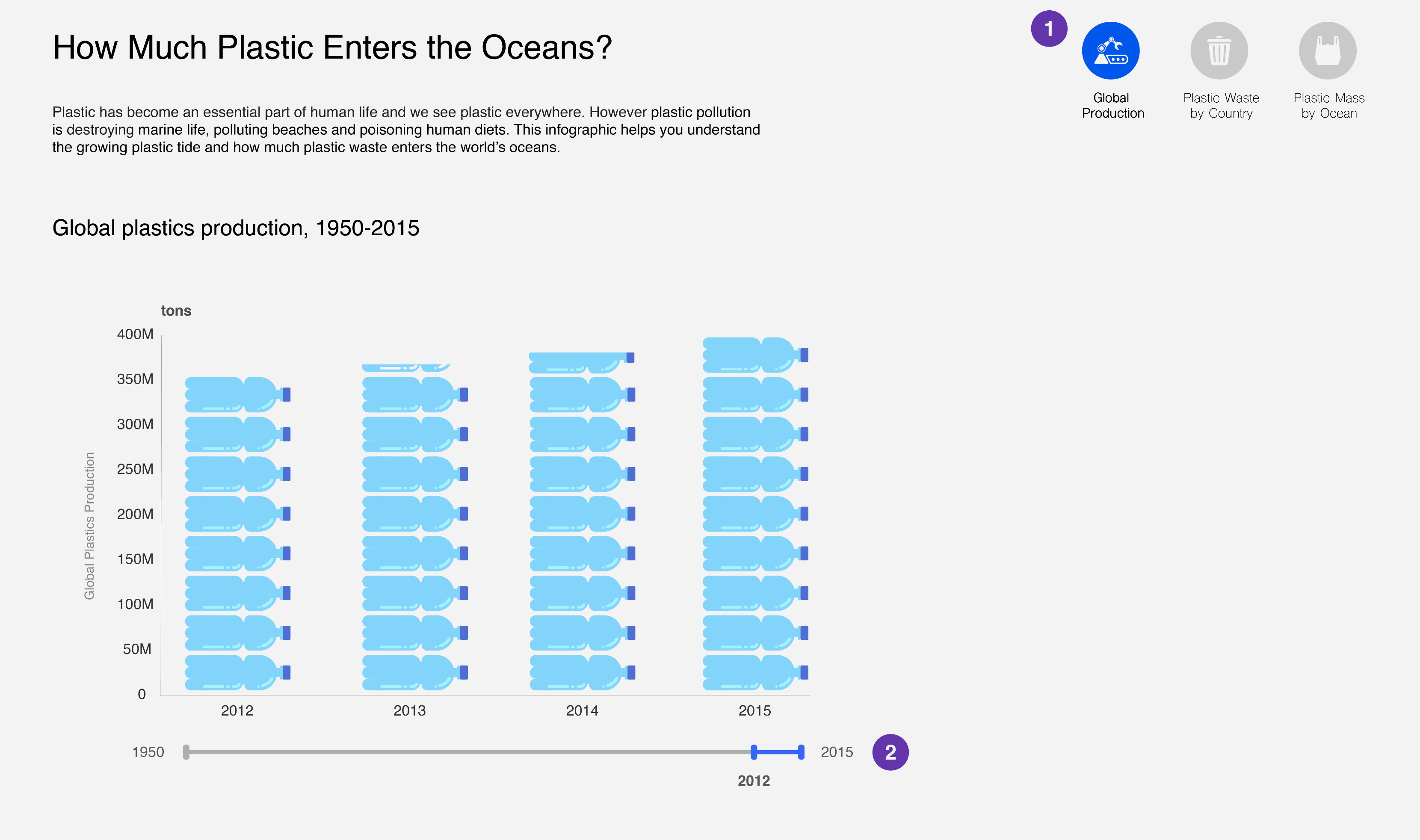
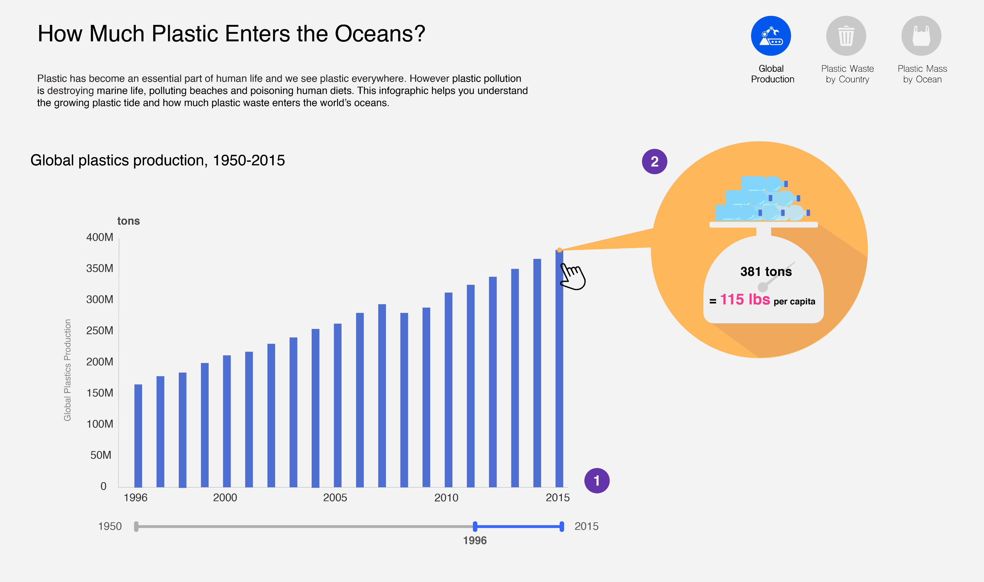
Global plastic production has increased and people have generated a lot of plastic waste all over the world. Plastic pollution is harming oceans and humans.
Interactive 3D globe map
Annotations
Intuitive icons
For presenting my story, I planed to use two narrative structures: an interactive slideshow and a drill-down story. I created charts and a globe map to help viewers to understand my dataset easily. In addition, I used various narrative interaction techniques like annotations, details-on-demand, timeline sliders, and filtering options.
1. The navigation buttons help users to move to the other pages. The blue color indicates the current page.
2. Timeline Slider allows a user to specify a range of time by dragging and the chart updates accordingly.
1. When the number of x values are more than ten, the bar in a plastic bottle shape changes to simple rectangular bar.
2. A chart shows plastic production detailed value when a user hovers the mouse over the bar.
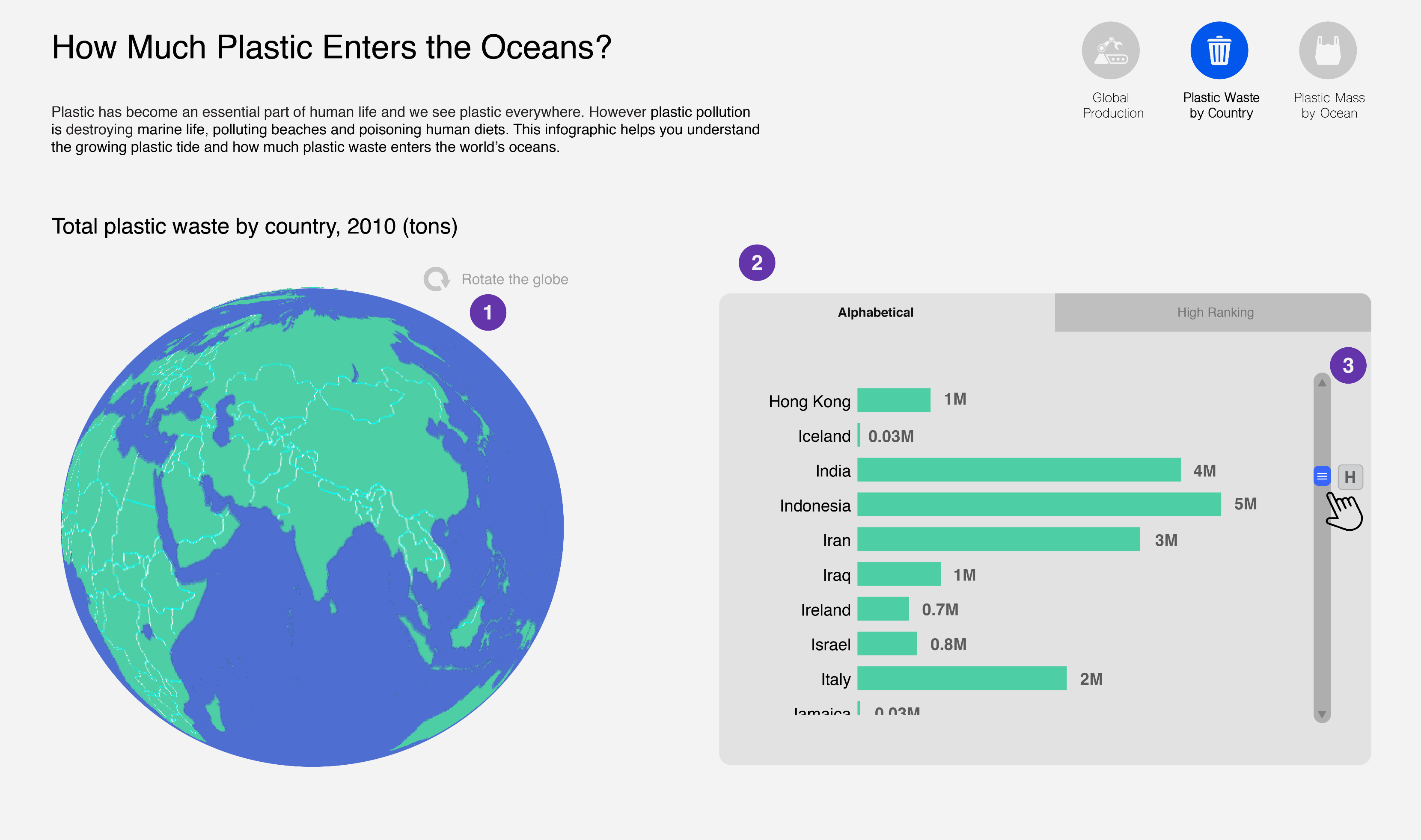
1. Users can rotate the globe map by dragging it.
2. The tap button allows users to choose the ordering between alphabetical and total amount of plastic waste.
3. The scroll bar allows users to navigate through countries. The alphabet indicator on the right side the slider knob tells users where they are.
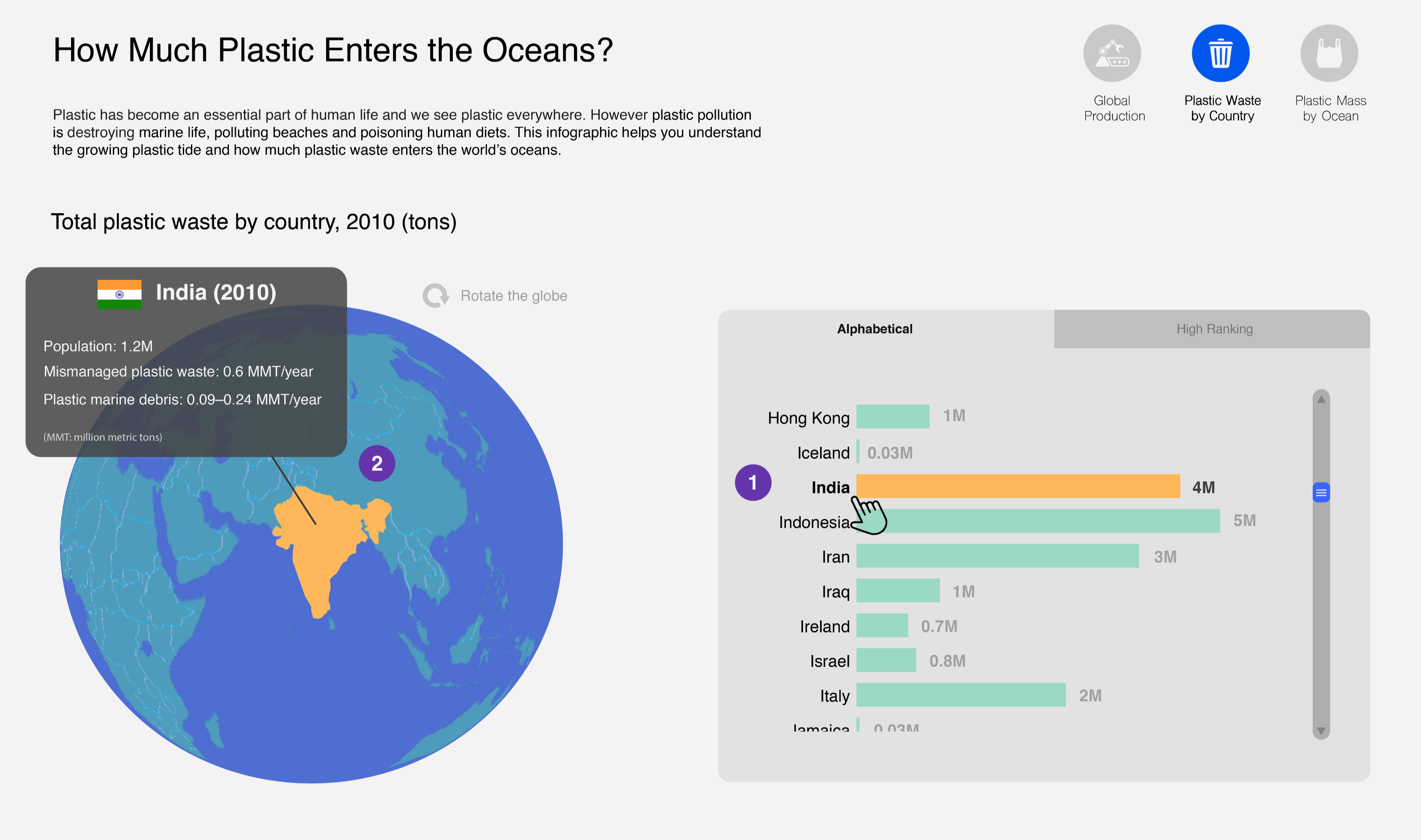
1. When a user clicks a specific bar or country name, the bar changes from black to yellow. At the same time, a global map shows detailed information with a yellow indicator.
2. Alternatively a user can click a specific region of the global map, and the relevant value label of the bar chart turn to yellow.
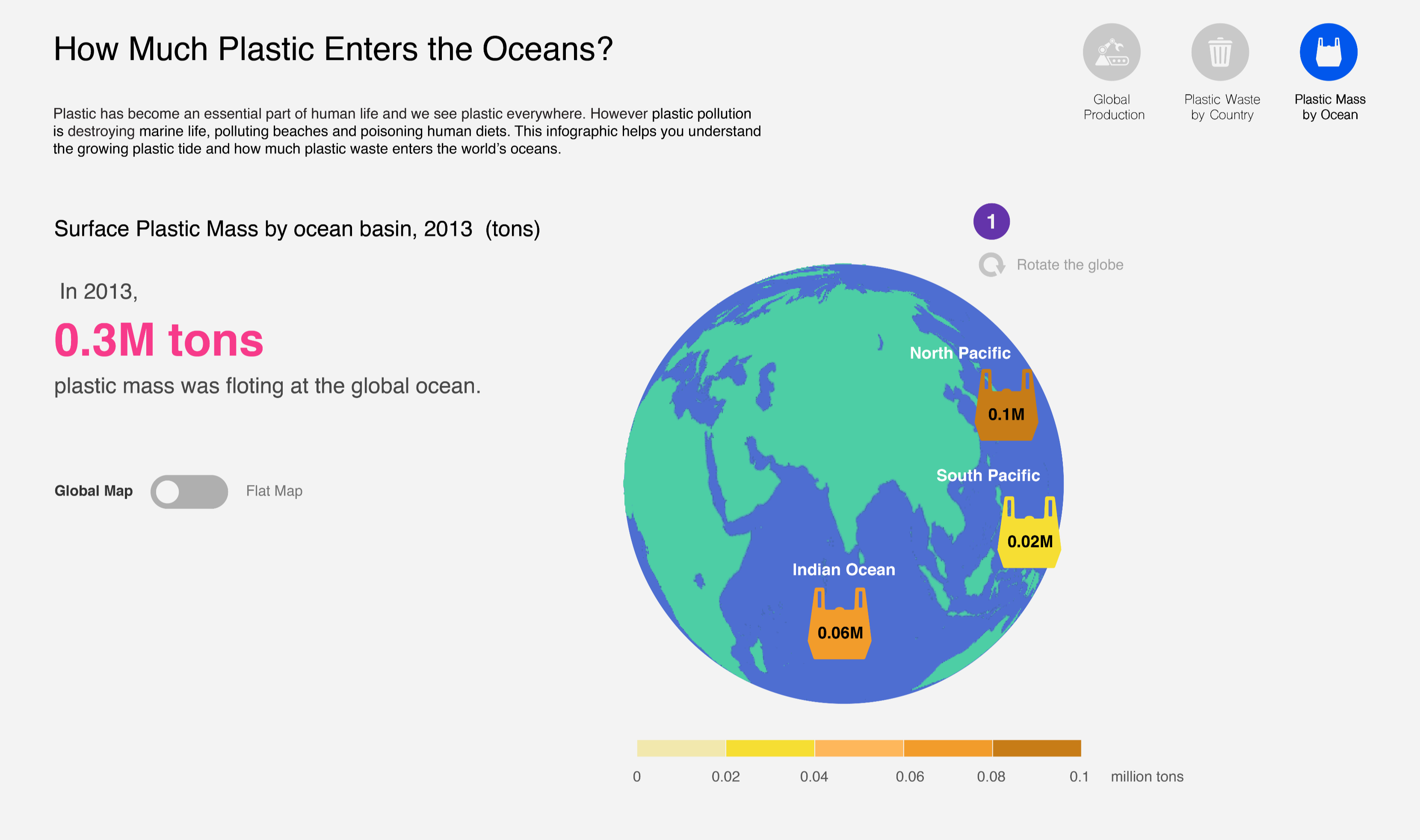
1. The globe chart allows users to rotate the globe to find information about specific region.
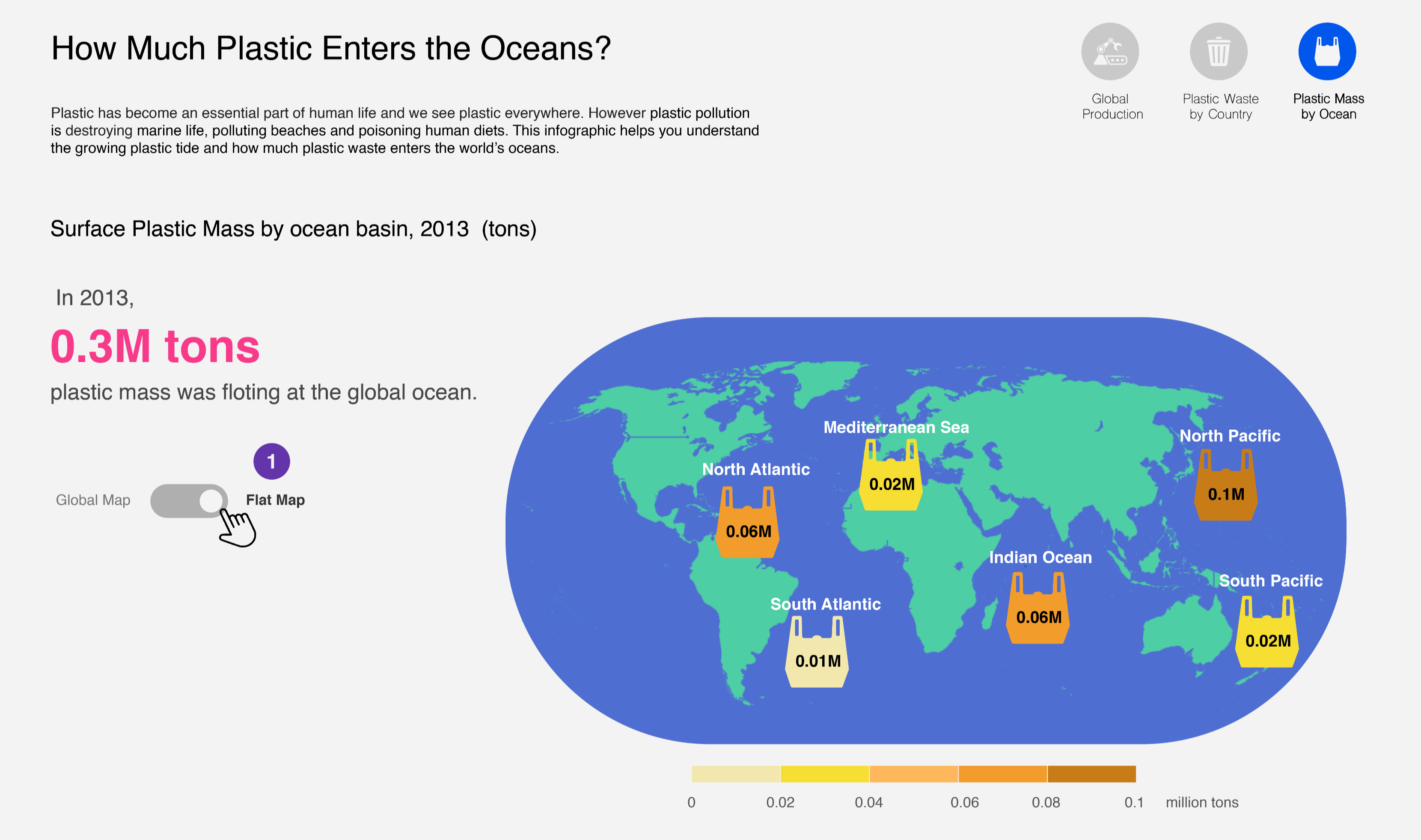
1. The toggle button allows users to choose one between the global map and the flat map.
• Source: Production, use, and fate of all plastics ever made
• Data Title: Annual global polymer resin and fiber production in million metric tons
• Characteristics of the data set: Data denotes annual global polymer resin and fiber production (plastic production), measured in metric tonnes. (1950-2015)
• Source: Plastic waste inputs from land into the ocean
• Data Title: Waste estimates for 2010 for the top 20 countries ranked by mass of mismanaged plastic waste (in units of millions of metric tons per year).
• Characteristics of the data set: Data on total national plastic waste generation was calculated by Our World in Data based on per capita plastic waste generation data published in Jambeck et al. Total mismanaged plastic waste is calculated for populations within 50 km of the coast in the 192 countries considered.
• Data Title: Model results for the total particle count and weight of plastic floating in the world's oceans.
• Characteristics of the data set: Eriksen et al. (2014) estimated the amount of surface ocean debris, divided by ocean basin and particle size, floating at sea. Particle size categories range from small microplastics to macroplastics.